No, I'm not talking about nuclear bombs. Explosive radiating growth refers to the sudden appearance of species at certain periods in the fossil record (we mammals did this once the dinosaurs were kind enough to disappear).
I was sitting here contemplating the rows (now two shelves) of Macmillan New Writing books and contemplating how the format has changed.
Back when Mike Barnard and the gang were considering launching the imprint, there was some consideration of putting them out in a highly standardized form, with the covers differing only in the title. Arguments in favor were lower costs, and a uniformity that would let both the publishing world and the public know there was a new kid on the block.
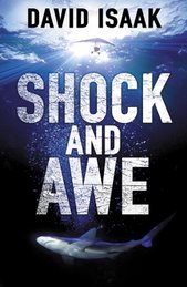
The idea about identical covers was scrapped (thankfully), but a very specific format was adopted—black spine with white title lettering (though the author’s name varied in color) in what I believe is known as “B” format height and width. The MNW logo began as black on white and switched to white on black for the 15th book, Matt’s The Secret War. (It jumped back to black on white once for Shock and Awe, probably by mistake, but possibly for reasons having to do with Freemasonry and the Illuminati.)
The design stayed basically the same for the first 38 books. Okay, they used a cursive font and (gasp!) a colored font on the spine title of Ann’s A Personal History of Rachel DuPree, and on Gavin Smith’s Dogfellow’s Ghost they introduced the new MNW logo. But they remained black-spined B-format books, all in a neat little row.
Until the 39th in the series, however. Matt’s Hoard of Mhorrer jumped up in height and width, and though it kept a black spine, the spine sported a pair of baleful red eyes and a calligraphed title in scarlet.
Since then, there is no telling what will happen. Doug's Thin Blue Smoke and Terri Wiltshire's Carry Me Home are both the same whopping size as Hoard of Mhorrer, and drop the traditional black spine, wrapping the cover color all around the dustjacket. (Truth is, they might have done that with Matt’s book, too. Since the cover itself is black, it’s hard to tell if it has a black spine.)
Len’s Very Persistent Illusion, sandwiched in between Smoke and Carry Me Home, reverts to Standard MNW Format (though they did go a bit wild and put a box around the title and author’s name on the spine). But Illusion might be the last we see of that format.
Indeed, there haven’t been two books in a row with the same design concept since Hoard of Mhorrer broke the mold. (Come to think of it, it was Matt’s first book where they decided to change the logo. Matt must have a mutagenic effect.) James McCreet's The Incendiary’s Trail is unusually tall and thin. Maggie's Beachcombing is the first paperback original; Faye's Trades of the Flesh is a paperback original, but a different size from Beachcombing, and Ryan's Acts of Violence is back to something like B format but is a laminated hardcover.
I’m neither approving nor condemning these changes, just noticing. If you line up all the MNW books in publication order, it is a smooth file of soldiers, differing only in girth, until you reach the last eight titles. Those eight look like—well, like the most of the rest of the bookshelves in my house.
I suppose it's very much like what one would get by lining up all the books of any other imprint by publication date (an exercise I’ve never undertaken). I guess this, plus moving out of the one-per-month mode, are the best signs that MNW is now an established imprint--with different methods than the mainstream, perhaps, but without a need to pointedly establish an identity through idiosyncratic dressing habits.
Subscribe to:
Post Comments (Atom)


4 comments:
I think it just shows that MNW has booted out the "Ryanair of Publishing" crap: the imprint is now mature enough that the titles stand on their own merits. "Acts of Violence" is just a crime novel that Macmillan put their name on. No need for stabilisers now!
Today's verfication word: Yo! Vege! (my punctuation).
As an inveterate individualist, I'm all for the abandonment of standardisation, so, personally, I'm pleased by this breaking free.
Always wanted to be seen as an un-trend-setter, David.
Your namesake (Mr Budd) lamented the lack of uniformity of the new books because they previously looked quite tidy on the bookshelf. Personally I like the random format, which reflects the random subject matter that MNW publishes, but I can see both sides of the arguement. Aesthetic vs individualism...
Hi, guys.
Like Matt, I can see both sides. The freedom is cool.
But the long line of black spines looked pretty nice...
Post a Comment