
Will, being the meticulous editor he is, thought this might need to be fiddled a bit, since, as those who've read the book may remember, the ship in question was a large tramp freighter rather than a naval vessel. But if there's such a thing as poetic license, I'd argue book-cover license extends even further.
And I've got to admit it's striking, and a great pair-up with the previous cover. Blue and orange are complementary, and in some of the Golden Dawn rituals these complementary colors are viewed side-by-side, and then the eyes are closed and the colors reverse in the retinal memory and a door into Yetzirah, the World of Formation, opens. So I'd suggest that everyone needs both the paperback and hardback; as occult ritual it comes cheap, doesn't require virgins or the slaughtering of goats (which can be pretty messy in your average home) and is far easier to learn than, say, scrying in shiny japanned black tea trays. So I'd advise you to buy both.
(nb. This works with blue and yellow, too, but, sadly, I can't recommend any books issued in dual blue and yellow versions. Guess you're stuck with this one.)


19 comments:
Wow! If anything, I like this better than the hardback. It's an eye-catching piece of work.
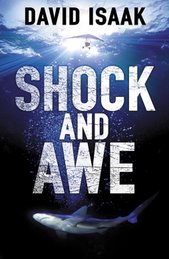
Looks great! From sharks to exploding planes...
That's a great marketing concept - a good read and DIY occult power! Why has no one thought of that before? Both covers look great, very striking.
Tramp steamers, slaughtered goats, yeah baby, looks good.
Thanks, all. It's eye-catching, innit? Though one of my (female) friends said, "It's stunning, but it just shouts 'guy book.'"
I take comfort in the fact that most covers don't shout at all.
I'm shocked and awed. Which was the point, really, wasn't it? Top.
Well, I can't argue with that.
I was going to say that.
That cover does look sweet. (That's the USS Alabama, by the way).
No kidding, Jamie? (I mean about the USS Alabama, not the Portuguese. If Portuguese it was.)
How much do you think the cover needs to match the story? And how did you come by this arcane naval knowledge?
Wow, how cool is that cover?
I expect Shock and Awe to hit the cinemas soon ("see Press for details!").
Congrats sir... World domination beckons...
Matt
Isn't violet actually the complementary color to yellow?
That's a fantastic cover, by the way, and one that seems somehow very "American" - it's got an explosion at the top!
The artist in me complains that the stark white of your name doesn't fit into the rest of the composition, and should have some gold/orange tone in it; but hey, far be it from me to argue with Professionals.
As an art director, I've taken TONS of creative license with stuff and people never knew. Without knowing the story, I'm not sure...
I'm writing a story with the USS Sangamon in it and had to look up a bunch of Navy stuff from WWII to find the right ship in the right place for the story. My high school also sat across from Puget Sound Naval Shipyard, so we looked out our library at the Enterprise, the Missouri (same class as the Bama, I think), the Nimitz, etc.
The "60" is the number of the Alabama. You could have the designer photoshop the number into something else, or wipe it off completely and you'd be good to go.
Sorry, don't mean to be kibbutzing. I think the cover looks great.
Hey, Jamie--
Naw, toss in whatever you know (which seems to be a lot). As to the link with the story, there is a ship (but a large freighter rather than a naval craft) and an exploding aircraft (but it does it on the deck of the ship) on towards the climax. But I have to say that it probably works better (visually) having it ka-boom way up high than on deck, as that allows them to slip the title and--ahem--my name, in between.
You and I seem to have lived in a lot of the same places, albeit at offset times. Not only did we both live in Oahu, but when I left Oahu it was for Seattle. Have you ever lived in California, Oregon, Alaska, or Tennessee (that's my whole list)?
Jake-ola!
Tehcnially, you're right on the color complementarities, but you can get away with blue/yellow just fine. Paint a blue square next to a yellow square, stare at them until you can't stand it anymore, and then shut your eyes...
As to the color of my name--hey, it was black last time; white this time is inevitable.
I was born in CA, moved to WA, then to AK.
I applied to the Sewanee Writers Conference a few years ago. That was the closest I've come to Tennessee...
David: Is this your ship?
http://www.rorysdeathkiss.com/display.aspx?cat=1&set=1&next=3092
Jamie--
Tennessee was a fluke. I won an undergraduate research fellowsip at Oak Ridge National Labs. Nobody warned me it was on the Other Side Of The Mississippi!
Jake-
Yes. It is. You visit some ODD websites, me boy.
ahaha. Should I explain, or is it more amusing left alone?
Post a Comment