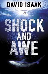
A writer friend who read Shock and Awe in manuscript form read it again when the hardback came out. She told me she liked it much better the second time. “Am I really that shallow?” she asked. “Should typesetting it and wrapping a cover around it make it seem better?”
I ought to note that more had been done than printing it up, of course: it had been edited. Nonetheless, the editing changes weren’t huge. So, my answer would be, Yes, you really are that shallow. And so, I think, are most of us.
One reason I don’t compose longhand—other than the drudgery of needing to type it all in later—is that my handwriting lacks authority in my eyes. It looks sloppy and scribbly, and, above all, it looks too much like I wrote it. I need the impersonal touch of type to be able to see it as prose. (I know a writer who counsels all his students not to write by hand because if you see it in your own handwriting it will seem better to you. This is a man who clearly has a different relationship with his handwriting than the one I have with mine.)
To me, format matters. It seems to affect my perceptions in a fundamental way. I revise on the screen as I write, but I still print out the pages the next day for polishing, because how I apprehend them on paper is different than on the screen. (And reading them aloud adds yet another facet.) In workshops or writing groups, when I’ve printed out full chapters for critiques, I invariably find something I want to change. And the whole thing looks different when the full manuscript is printed out, and startlingly different when galleys arrive. (I had to quell the urge to engage in substantial rewriting at the galley stage.)
Pamela reads books on her PalmPilot when she travels (and during boring meetings—don’t tell her bosses). She even has copies of my novels on there (there’s a dandy little piece of software that converts them). I find the format almost impossible to bear—yet there, once again, when I see my words in that tight, isolated format, I see them differently.
A writer over on the Absolute Write forum said that before he sent his manuscripts out to other writers for critique, he planned to use Lulu to print up paperback copies in typeset form. I’m not sure I’d go that far (though I can see the appeal). But I might print out my manuscript with something akin to book margins, book fonts, and book spacing to do a final edit. Anything closer to galleys would make me see it from a fresh perspective.
Monday, May 5, 2008
Subscribe to:
Post Comments (Atom)


8 comments:
I've never had the privilege of editing galley sheets (unless you count the newspaper I worked for back in '95) but I will say that for me, at least, there's no point in editing onscreen. Until it's printed out it's not "real" and I'll just glide over typos or missing stuff because, after all, I knew what I meant.
I'm printing up for the first round of edits too, especially because there I'm aiming for the big picture and a computer screen inflicts tunnel vision on me. The final polish will be done onscreen though, because I'll be doing a search and challenge for pet words, and adverbs, and such-like. I've done it on short stories, and it works well for that.
When it comes to being drawn in by somebody else's prose, I don't think it makes a difference whether it's paperback or hardback. I measure a story's "value" by how oblivious I get to my surroundings, and that includes the paper. Very little will suck me in if it's on a computer screen though. I'm too used to flitting from screen to screen. Even your blog post got read in two "sittings".
Hi, Jen--
I count newspaper galleys as galleys. In fact, seeing something transformed from a typed page to news or magazine columes is usually kind of startling. (I'm easily startled.)
Hi, Janet--
Paperback vs. hardback doesn't make much difference to me unless the hardback weighs 15 tons.
But I do find a big difference between typeset and manuscript. Even bound, manuscript pages are awkward to read; 8 1/2 x 11 or A4 is just an awkward size to relax with compared to, say, 6 x 9. And double spacing tends to distance me from the prose in manuscripts. To use John Gardner's example, it changes "...a dog was rummaging through the garbage cans..." to something more likely to read as " a dog was "
I admit I'm tempted to use Lulu at some point in my drafting process - probably penultimate (let's hope that means 'second') stage.
Creating the text as a 'book' certainly promotes a different kind of relationship with it.
Yes, yes, yes. I need to see what I write printed out, and the closer it looks to the way it would (will) look as a book, the better. Sometimes, when things are going badly, I change fonts to get a new focus on the text. Say, Garamond instead of the standard TNR. Occasionally, I revert to Courier and pretend it's been typed up by someone else. I also find myself justifying text and then rewriting with an eye to word spacing, which is totally stupid...
Hi, Tim--
It would be nice if penultimate equalled second. Or, better yet, first!
Hi, Charles--
Well, I've never rewritten to improve the spread of words in justified margins (not yet, anyhow), but I understand exactly what you mean: the way it looks affects what is said.
I'm not a poet, but I understand their obsession with layout!
Post a Comment